
BLACKSEEDZ
01 — CONTEXT
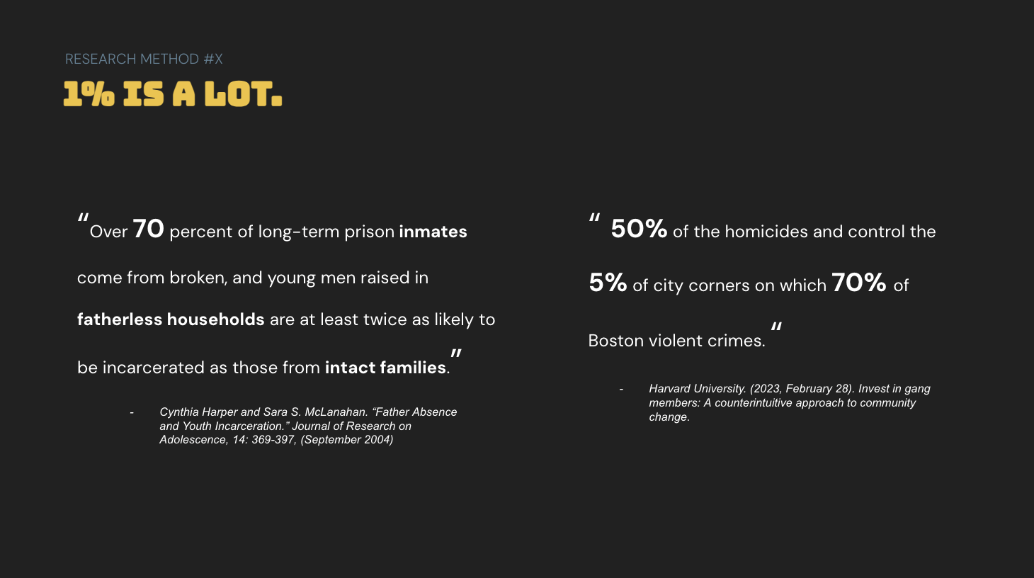
Watching my friend, whom I’ve known for years, become slowly entranced and indoctrinated into a gang affiliation lifestyle. Seeing this in real time pushed me to create Black Seedz. a nomadic, career searching, event-based, nonprofit organization that is determined to steer at-risk teens in Boston's neighborhoods—Dorchester, Roxbury, and Mattapan away from gang violence and gang activity and violence.
02 — THE QUESTION
This lead me to think this: What if we brought the oppurnity to the youth and breakthough the limits that society presents to us?
03 — RESEARCH
This lead me to think this: What if we brought the oppurnity to the youth and breakthough the limits that society presents to us?
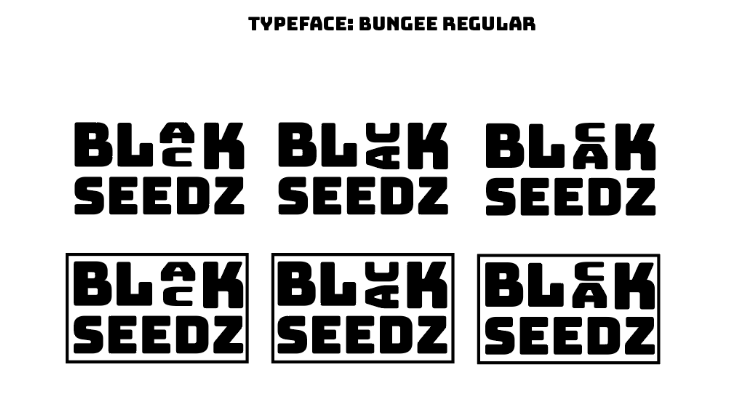
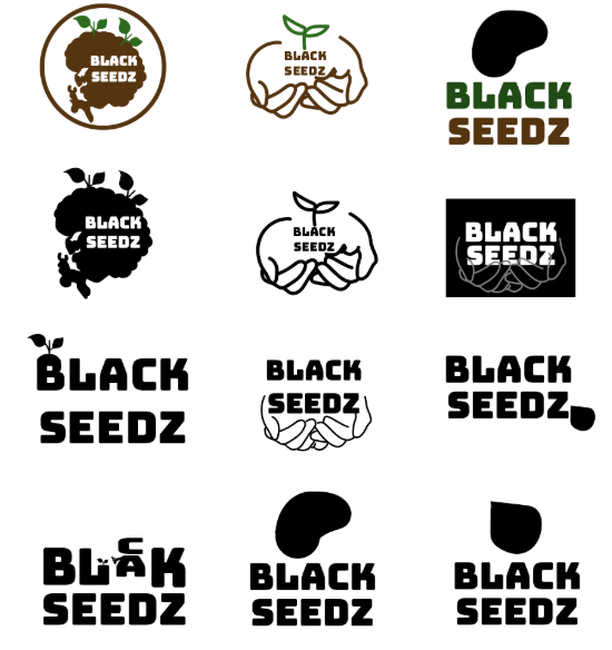
The name Black Seedz became enough for me once I realized I visuals were doing too much. There is already power in going to these communities and directly bridging the gap inbetween poverty and employment. The name became the most important part of the brand to me. The question was without the icon what does Black Seedz. Then the answer became clear as keep sketching. I came up with stacking the letters for two reasons. One the stack of the a and the c creates an enanging interaction with the viewer and better proportions with the word “seedz” and thus a cleaner and cooperative visual reationship with ‘Black”. The stack words became about the brand. The second reason for the vertical stack is a compliment to the programs offer for vertical growth in the lives of black teenagers.
04 Framing
04 Framing
FINAL OUTCOME

kendrick Lamar thinks like a jazz musician
CONTEXT
We love to admire the man, the artist and the performance but I know I am not the only one that goes on in the mind of Kendrick Lamar. This is for the ones that want to do more and made more for themselves and for the mainstream. Kendrick represents what kid that has a seed of inspiration planted in them.
ORINGINAL
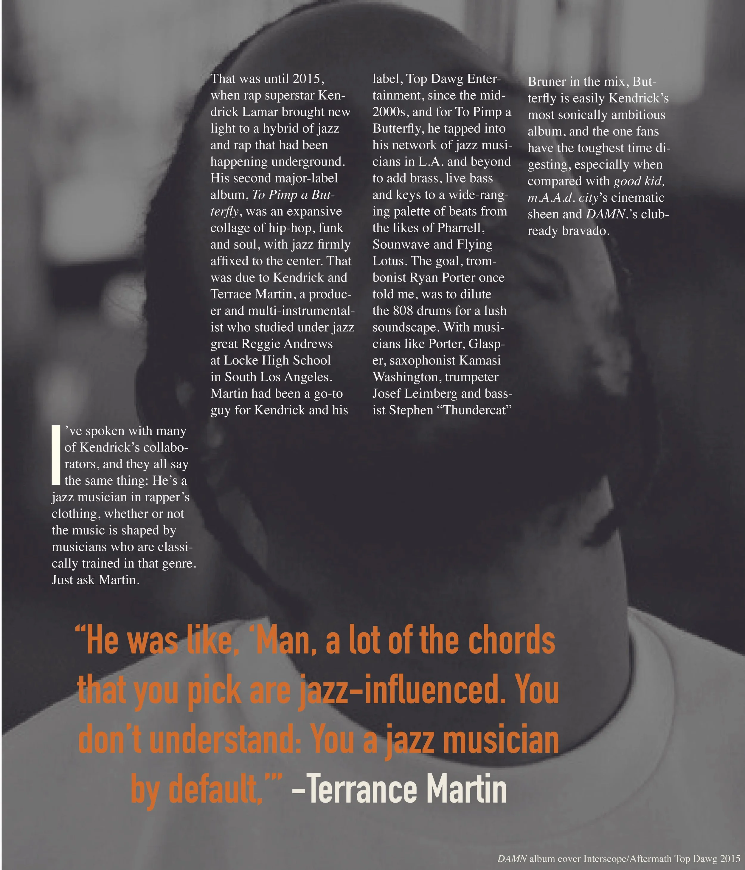
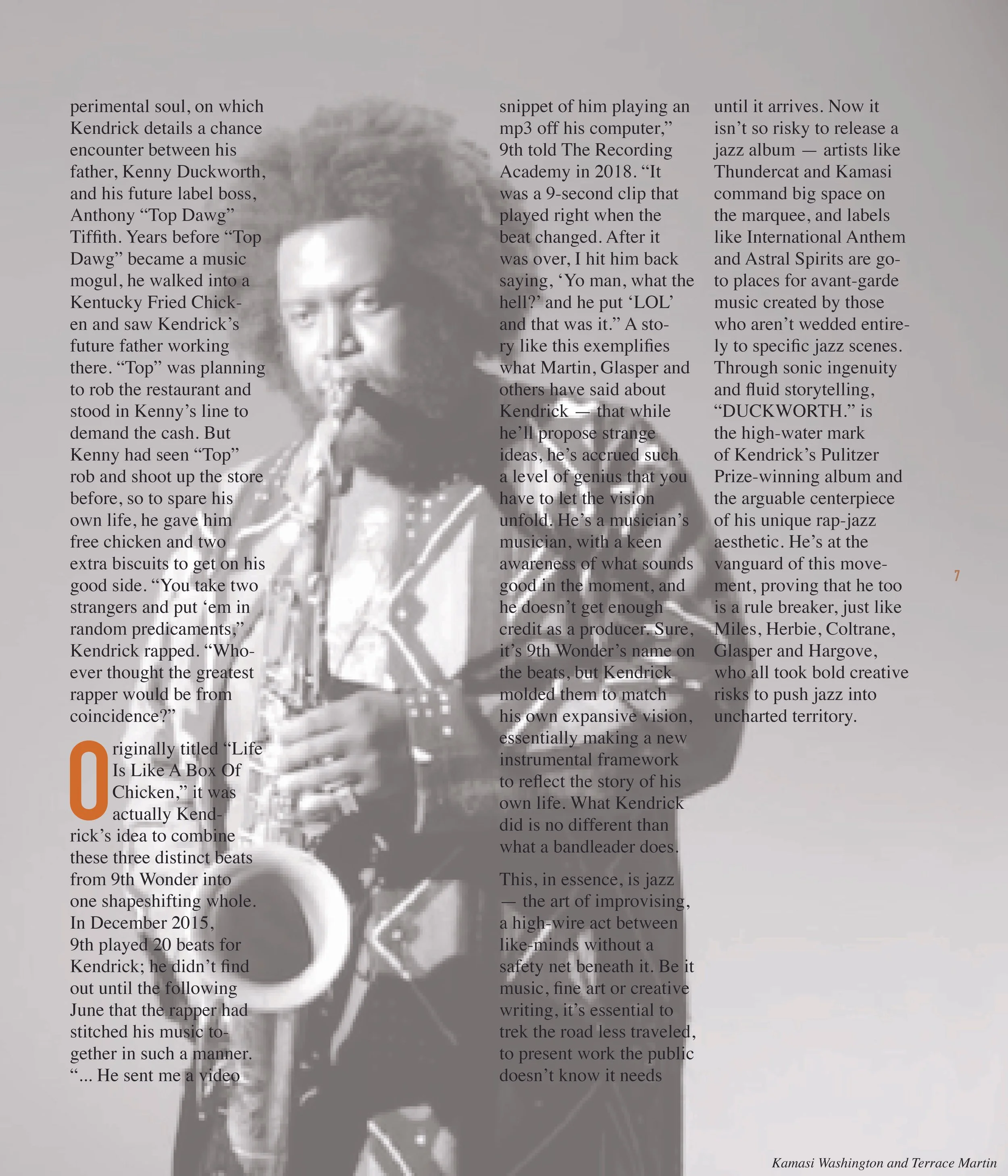
When I designed my oringinal take on Kendrick it was 2021. Though the artist was still majorly impactful this was one of his quitier periods of his career, years before his GNX era. At this time my protrayal of any concept was to be as straightforward as possible using calm earthy and neutral colors to represent one side of the genre.
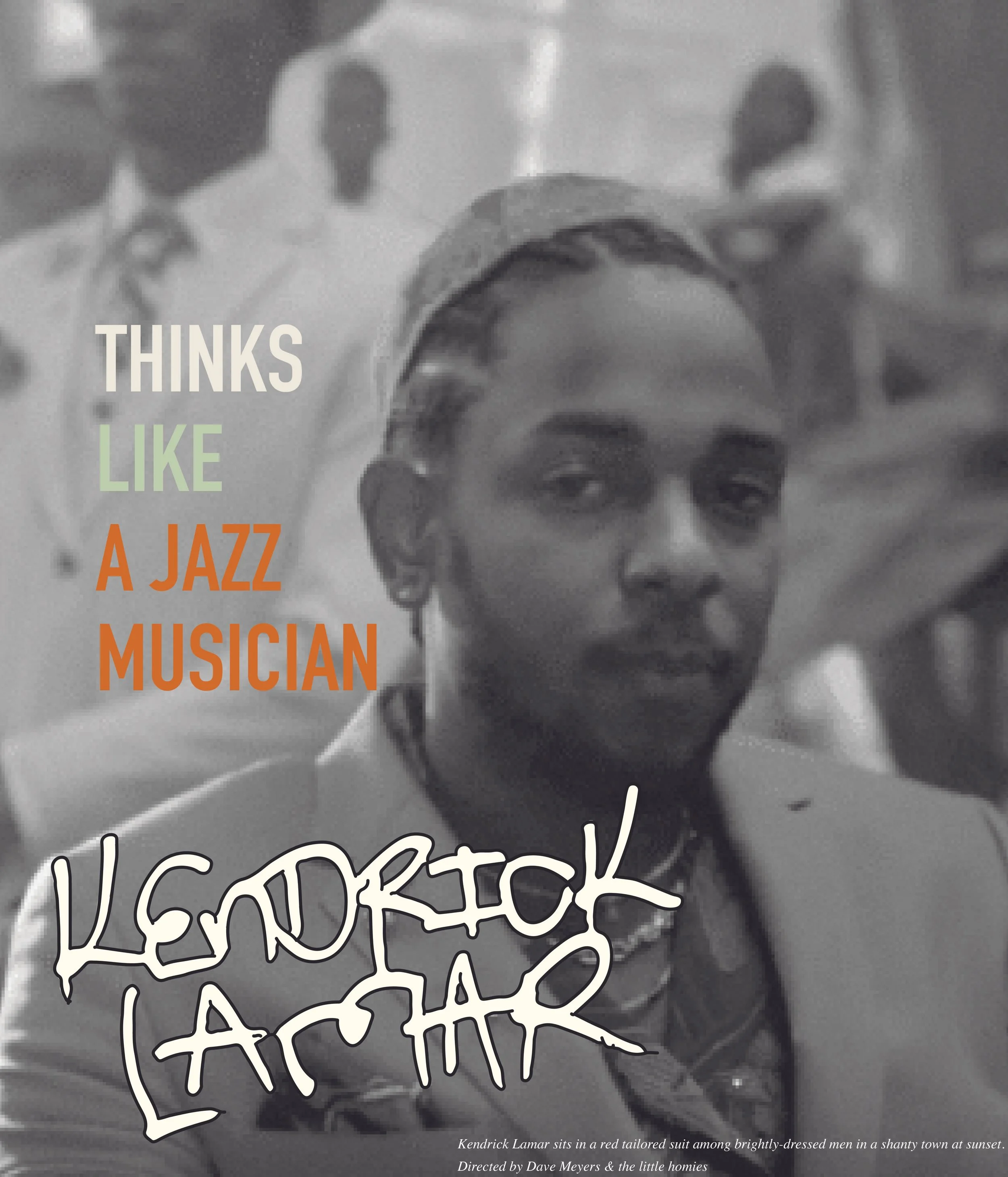
Though my eye for design had potential it was still underdeveloped as the entire direction was scattered as so where my paragraphs (ref second image) and placement along with image chose was a major issue that clashed through out the magazine spreads. These were elements I sought to clean up in my revision process.
FINAL
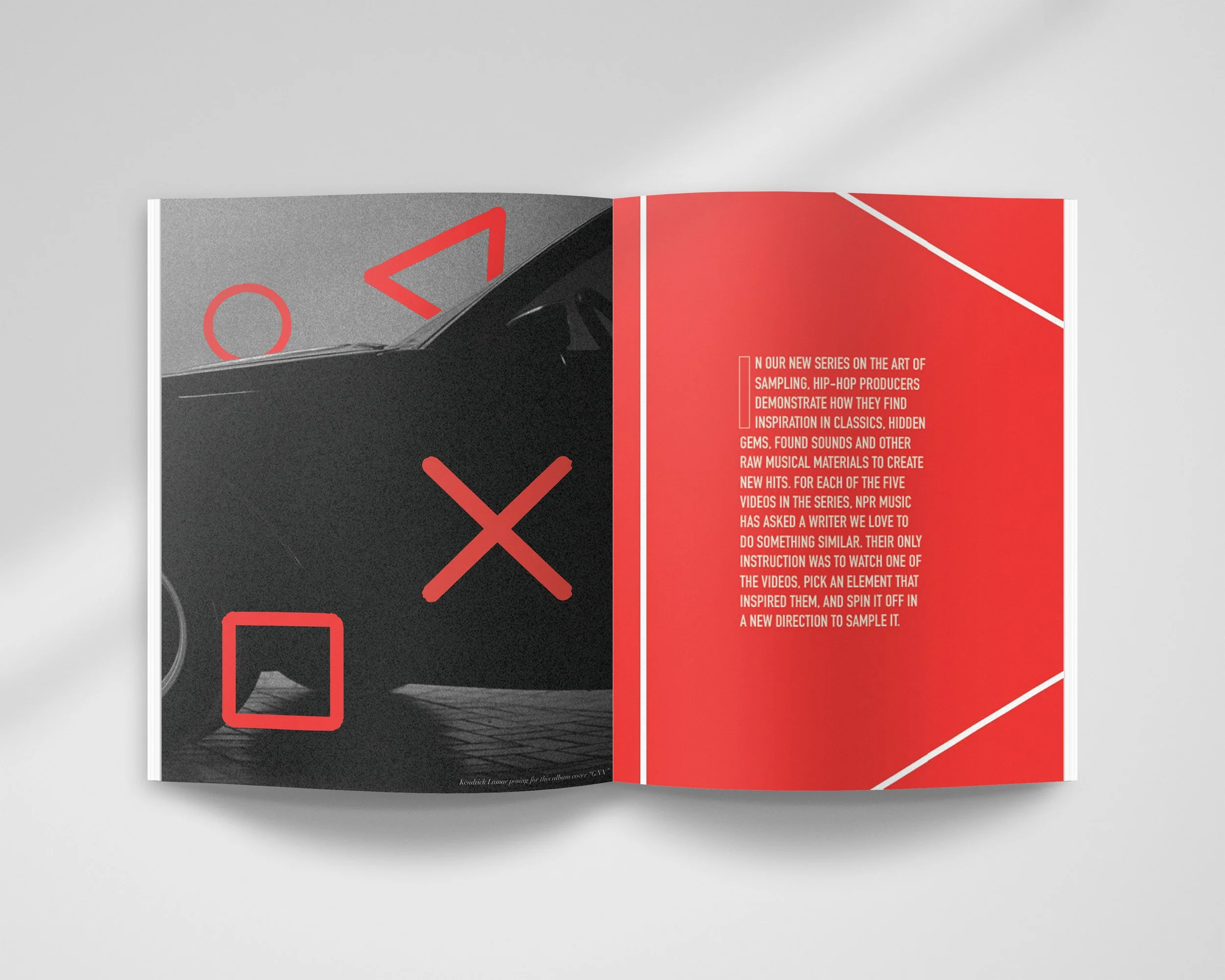
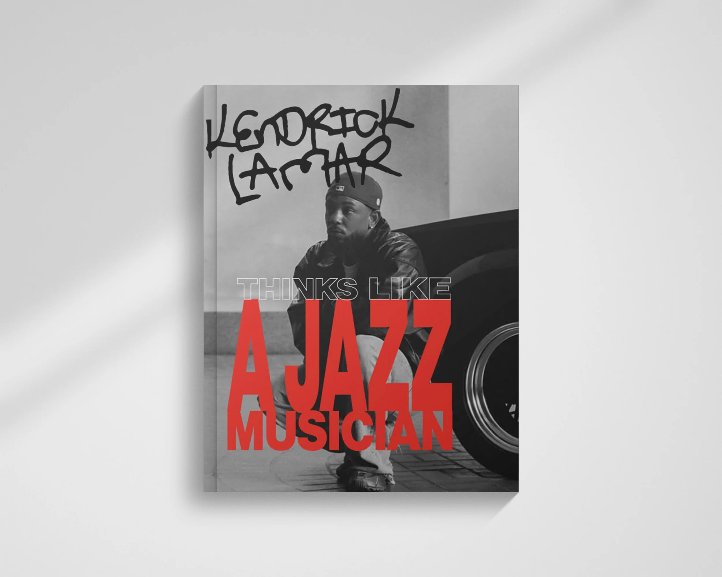
Now, yes Jazz is known primarily for it’s blue tones to many I wanted to challenge that visual narrative as both a lover of jazz and an designer. The color red was speaking to me the most as red is the attention grabbing color there is. I looked at jazz album covers from the jazz label impluse! that would showcase brass and expressive colors and emotions in there work. As a design I work counter to cultural assumption not for fun but because that is my core
Don’t let the minimalist palette overshadow the multi-layered showcase of the powerful imagery displayed on these pages. Working through the framework of faith. Faith that I and others like to become a BLCK Butterfly without the Apology.
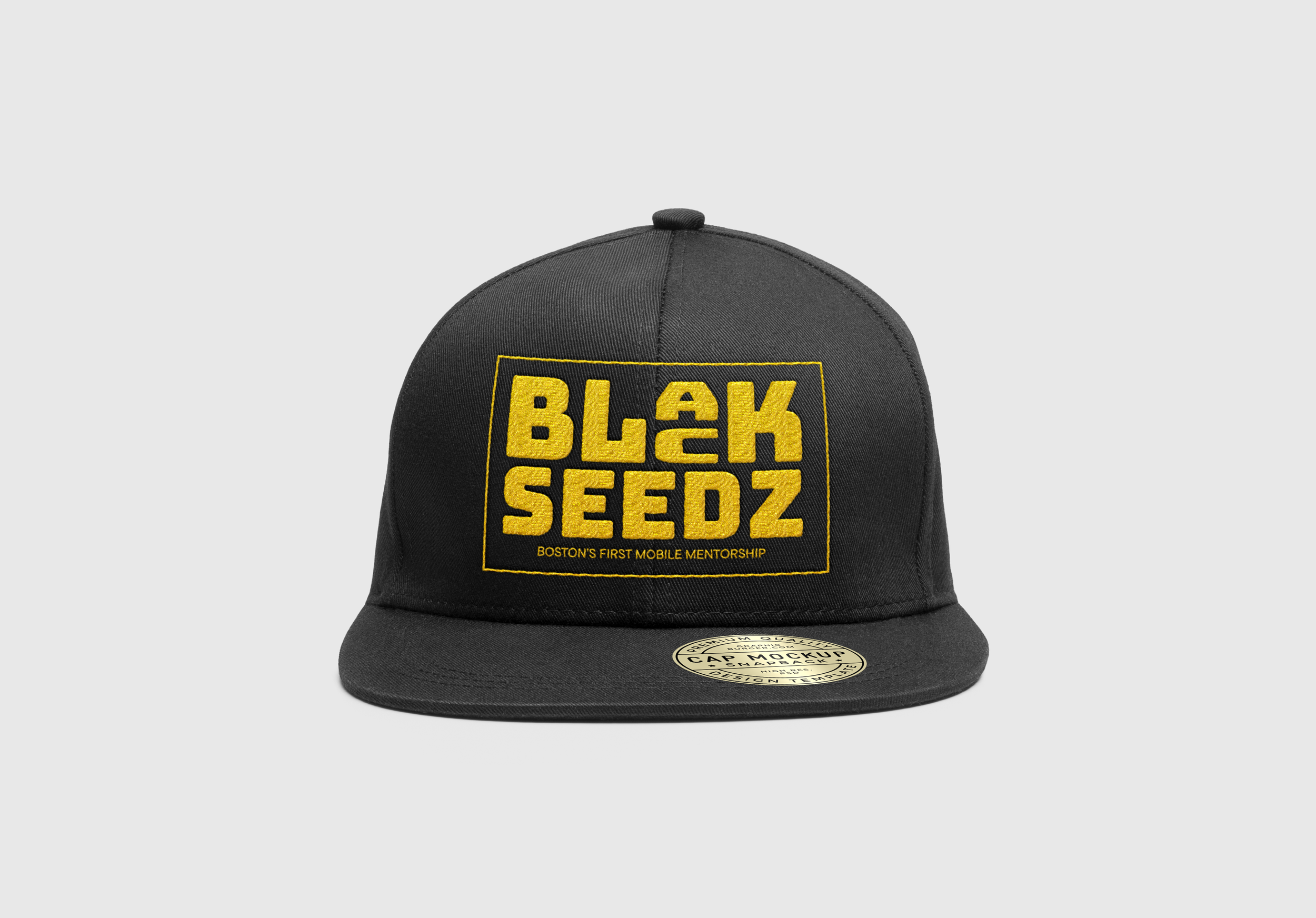
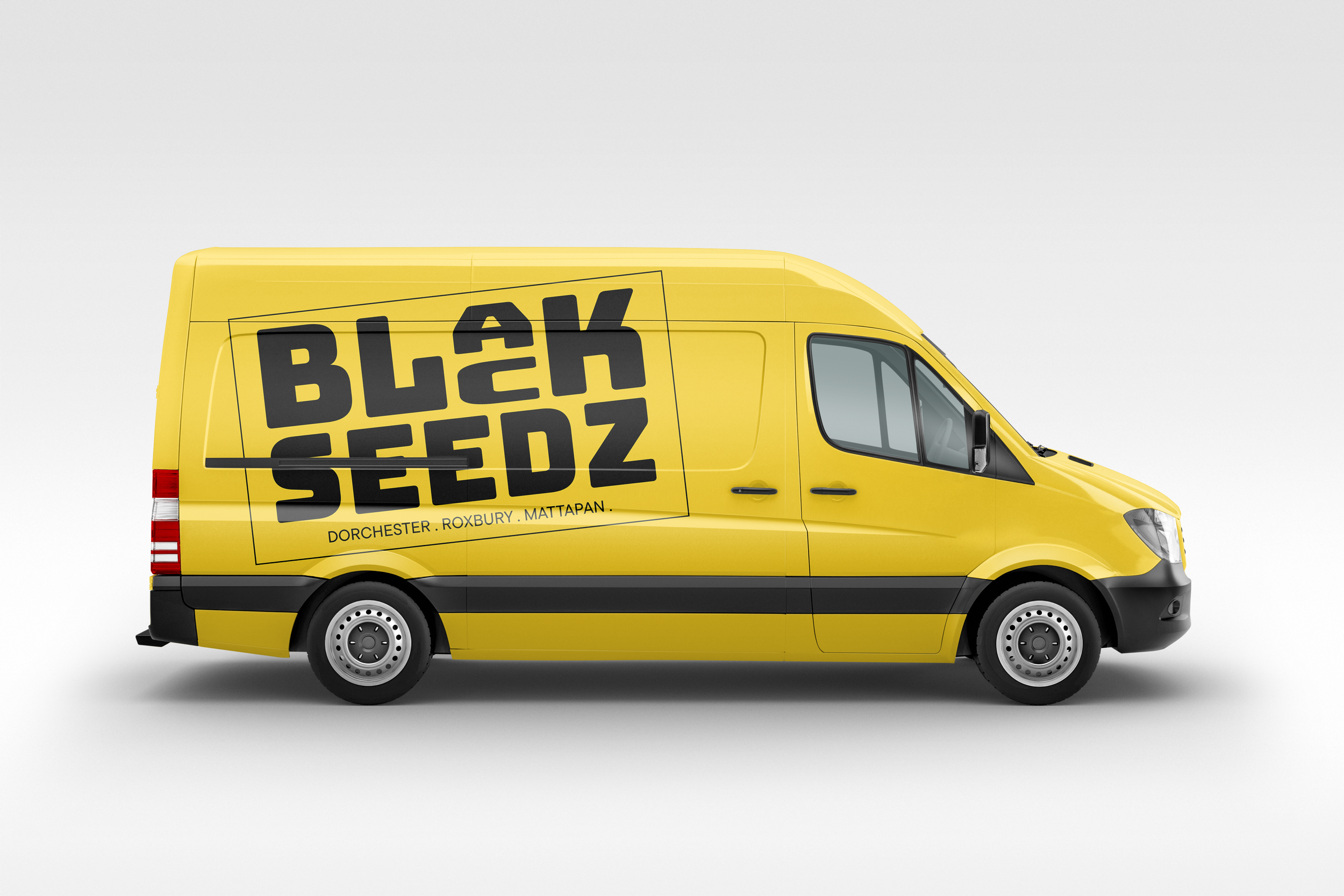
In a world where disenfranchised communities are painted in shades of greyscales, Black Seedz needed that yellow like sunshine to bring to these neighborhoods. A color that breaks the narrative, that grabs the attention of the everyday kid walking down the street. Complemented with bold and sharp text that wastes no time in sharing its message through simplicity.
Using Bungee Regular became the perfect typeface for this project as it matches the visual identity of this project. While it maintains this balancing act of establishing itself and standing out in a world filled with brands and products trying to get one’s attention. Black Seedz in this because of it’s resisent through the use black and white imagery as a backdrop to made the yellow shine to bring in more attention.

01 — INTRO / CONTEXT
When we think of kids, many of us think of loud, rambunctious, and unfocused little people running around. I have always seen more than that in them. I see Jesus in them. Jesus is Us is a feel-good, heart-warming, coming-of-age story that integrates three different plot lines into one. The story of how DeAndre, Amelina and Stokely all make the effort to change and transform their communities.
02 — EARLY DESIGNS / EXPLORATION
Originally, I came up with The Jesus Children’s project as the original title which was a concept that has been floating in my head months prior to the original creation of this movie poster. Whenever I have an idea in my head or a title in my head, that’s where the creative journey starts. It becomes an era of my work to explore childhood and faith.
03 — DEVELOPMENT / DESIGN SYSTEM
However, after much deliberation and exploration of theology, I then decided to call it Jesus is us, emphasize embodiment in action and faith. This change stands out from a lot of other faith base and especially Christian movies where orthodoxy is prioritized over orthopraxy, which is the practice of faith and the execution of one’s beliefs in the real world and how that shows up.
One aspect that stood out from earlier drafts is the handwritten type that feel authentic to the brand shift to having this type be the main visual identity of Jesus is Us. At first I used the typefaces of Rockwell for the color letter blocks along with Tommy’s handwriting for the script type.
04 — FINAL
The best way to reimagine the brand was to create a script myself, so I wrote the entire alphabet with my left hand and created my own script for the brand. Along with the title change I wanted to lean on a simple visual identity system of blue and my custom script rather than having the brand have the competing elements of the colored letter blocks. Also, to better communicate the theme I have less images for a cleaner and less cluttered design to communicate to the viewer the themes of this movie.
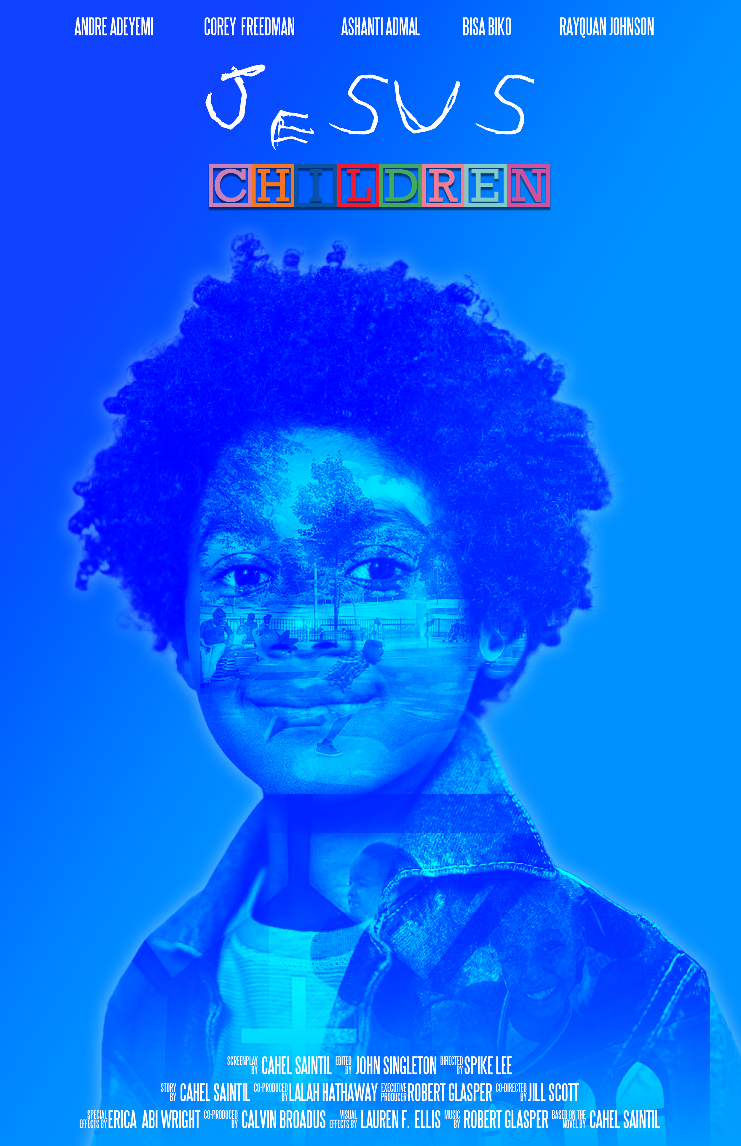

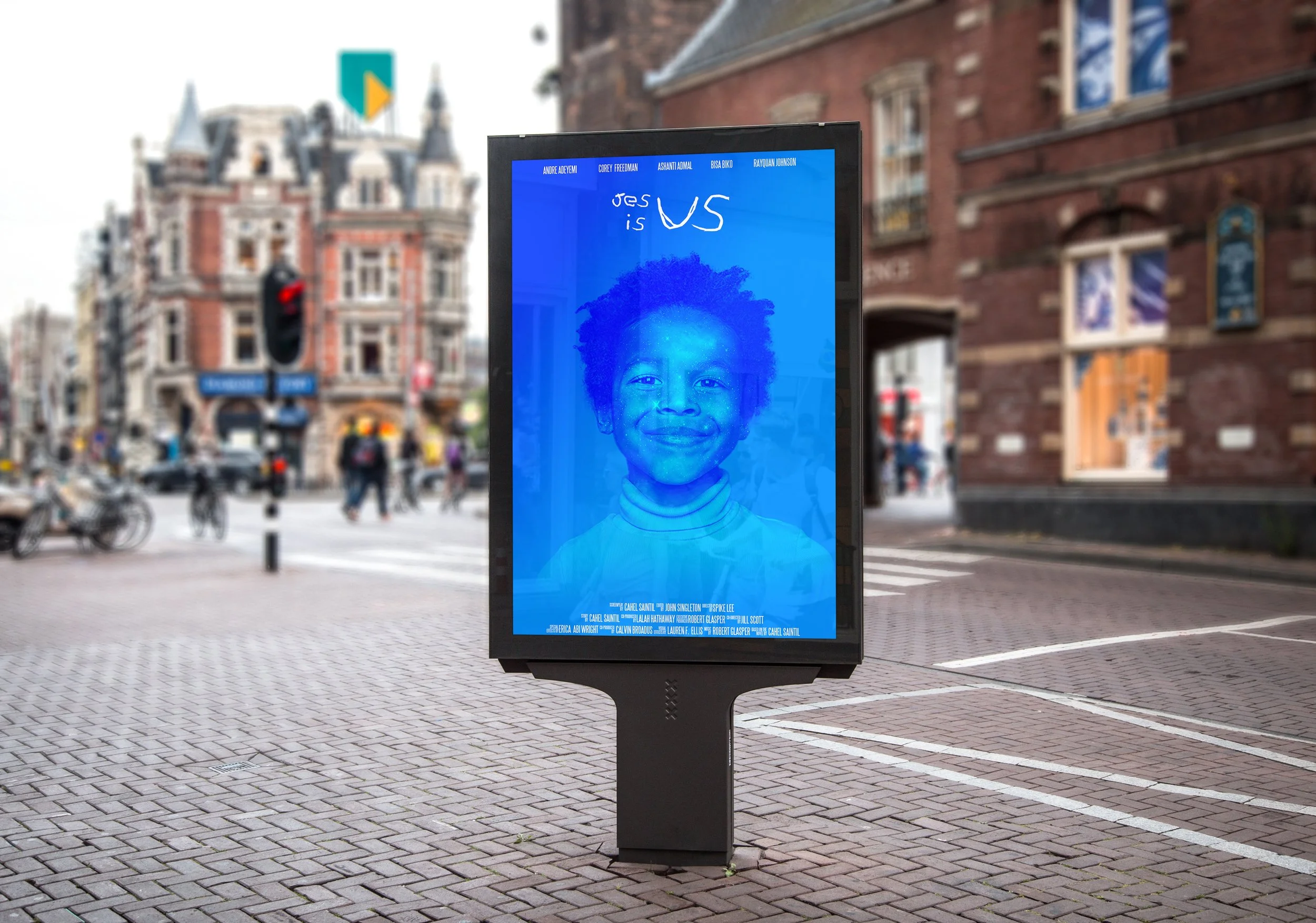
JESUS IS US

My work has always been countercultural, and Jesus is Us is no exception. The monochromic blue adds to this experience through the calmness and serenity it provides, partnering with portraits of these children as they showcase the spirit of Jesus through their actions in this film.
04 — THE REFRAME
What did the research change?
Initial framing
Prevent gang involvement / redirect at-risk teenagers.
Reframed understanding
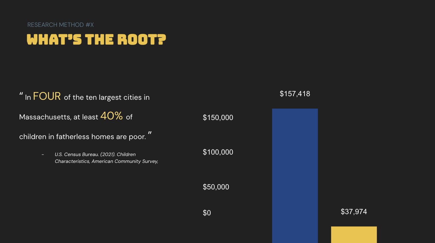
Bridge to accessibility and the job network, to sercure income and obtain family financial support during the off season to combat poverty head on
New direction
Create access to:
Jobs
mentorship
exposure
Mutual aid
community
Year round guidance
05 — PROGRAM STRATEGY
05 — PROGRAM STRATEGY
What would BlackSeedz actually do?
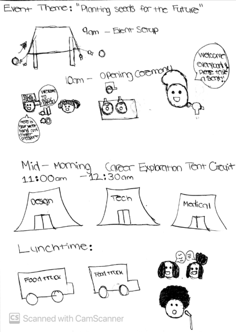
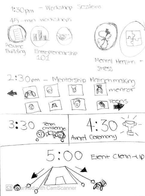
Show original sketches + refined diagram.
Potential pillars:
Explore → what your career path is
DEVELOP → the skills and passion
CONNECT → with mentors and leaders
CARE → mental health / and financial support
BECOME → who you want to be not what you “have” to be

